There is very little reason to assume Goshen College’s school colors are anything other than purple and white—even though we do tend to order black t-shirts for our campus events.
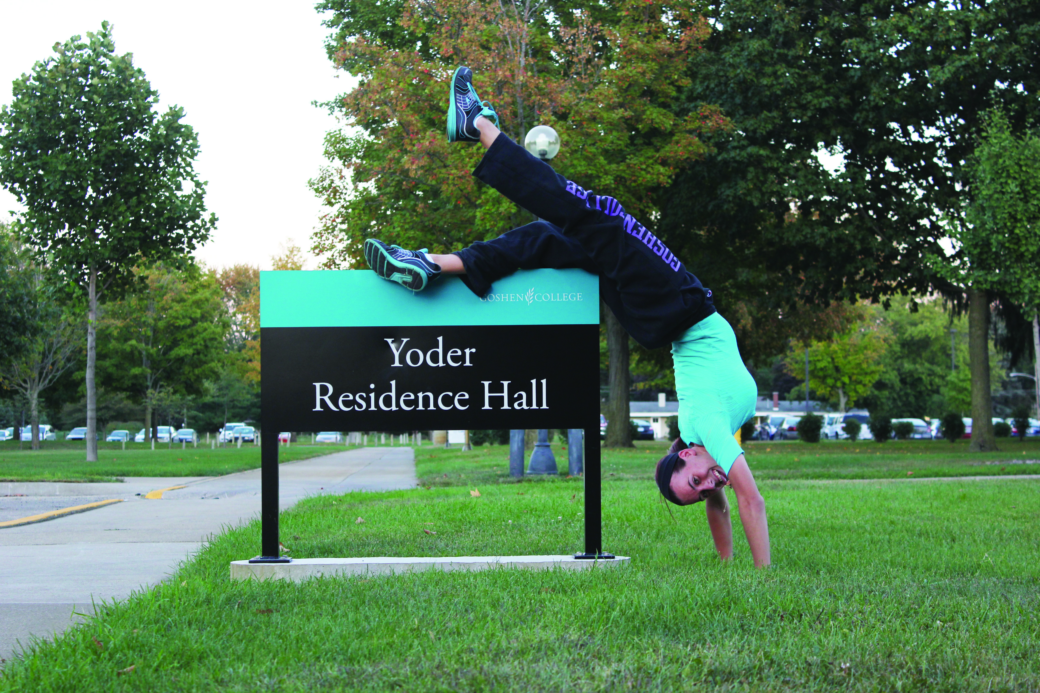
Some of you may have recently noticed a new dramatic color change parading about campus. If not, you can discover it for yourself by going to any building and looking at its identifying sign.As an art major who has never approached the subject of aesthetic principles, these signs have directed me to finally do so. I find that these signs inflict great harm on my aesthetic psyche.
Several theories have surfaced as to why anyone would want to offend the eyes of campus pedestrians with these oh-so-harmonious color schemes. “There’s no method to the madness,” said my fellow art major Justine Maust, a senior.
Since I’m writing a humor column and not a news story, I think I’ll neglect to interview anyone that actually knows anything about the topic and instead share some entirely plausible guesses.
Perhaps someone made the color wheel into a dart board and then threw a couple darts to determine what color each individual sign would be.
Or maybe the sign-ordering individual had recently undergone eye surgery and used a seeing eye dog to assist in the color selection process.
Or maybe the intelligent designer was attempting to catch on to the double rainbow craze of 2010 to increase the enrollment rate. I sure hope not: there have got to better ways to get people to come here. (iPad jokes, anyone?)
But the most plausible theory was espoused by a Phys Plant supervisor, who said, “It looks like Candy Land.”
That’s right, readers. Here’s the real reason the colors are out of control: the staff members are secretly organizing the world’s biggest game of Candy Land, and we’re the pieces. You can expect CAC to put up a poster about this any day now.