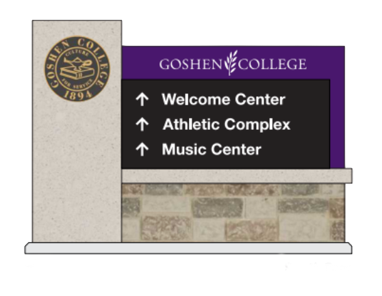

Upon returning this spring semester, members of Goshen College noticed a new addition to outdoor spaces: redesigned directional signs marking locations on campus. The signs are solid black, featuring white script and an accent of purple. The former signs, which were a variety of colours such as orange and yellow, were part of a marketing plan from over a decade ago.
A main incentive of the new signage was to create more awareness of the college around its perimeter. “Our campus is unique,” said Brian Mast, head of Facilities. “A lot of college campuses you drive through the middle of the campus, or they may even have main roads that go through the middle. We don’t.” Mast noted that because GC is pedestrian-centered, motorists passing by the college may have a difficult time recognizing that the college is there. This shortage of visibility inspired the plans for more promotional signs on the outskirts of campus to “connect with the interior,” as Mast put it.Before the redesign plan, there was a sign on the corner of College Avenue and 15th Street, and one in front of the Union Building, but nothing on College Avenue. He said that new sign plans will try to “tie into what’s already on campus,” and mentioned the pillars and stonework of the Aurora gate on Eighth Street as a model that new monument signs will be based upon. Additionally, the signage plan is seeking to address the issue of sports spectator confusion when finding the Roman Gingerich Recreation-Fitness Center, since it is not accessible directly off of a main road.
The interior of campus is also receiving further upgrades, including pedestrian, parking and kiosk signs, as well as general wayfinding aids to help those unfamiliar with campus navigate it. Pedestrian signs will feature lighted script to remain accessible after dark. On the bottom of many of the new signs will be a tumbling leaf pattern, the same accent used on the first floor wall of the Westlawn Building. “The leaves come out of the olive branch … are here for a time, and then scatter,” Mast said.
He went on to say that the signage project is part of a larger effort to make sure that “when you’re on Goshen College campus, you have a sense that you’re on Goshen College campus, and there’s a cohesive story.” The other aspects of this aesthetic project include the renovation of Westlawn, the second floor of Wyse hall, and the rebranding of the RFC, changing the paintwork to standard GC purple.
GC is working with Abonmarche architecture and Hayes Design Co. for the redesign. Signs which mark campus buildings will be reused for the project after having been refaced, re-lettered and returned to their spot on campus, because as Mast noted, “There’s nothing wrong with them structurally.” The sign project is supported by a donor-advised fund dedicated to outdoor campus beautification.